Positioning detached elements
The layout of detached elements is done similarly to how the rest of the document is laid out, with CSS attributes like position, margins, and transforms being applied to detached nodes as defined by the specification.
Unlike other HTML elements, the detached elements are visible even if they are moved outside the viewport.
This is provided as a developer preview and is subject to change.
Example transforms
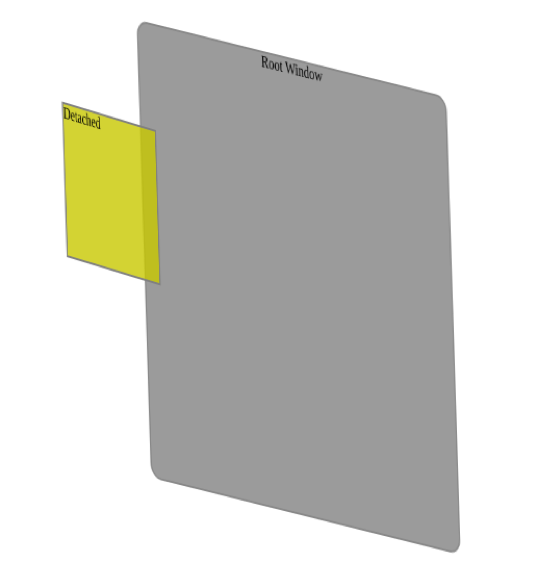
Translate3d
CSS:
    .translateDetached {
        transform-style: detached;
        transform: translate3d(-50px, 0, +50px);
    }
This renders as below:

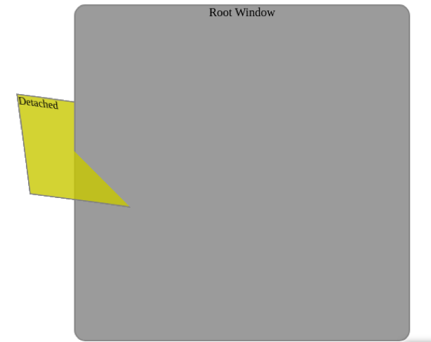
Rotate3d
CSS:
    .rotateDetached {
        transform-style: detached;
        transform: rotate3d(1,1,0, 40deg);
    }
This renders as below:

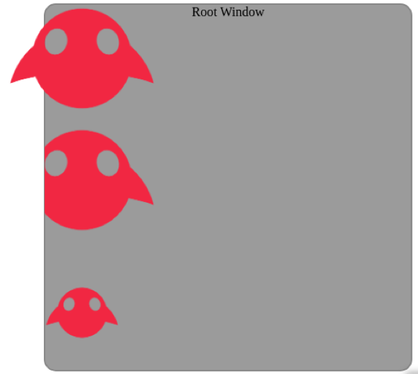
Scale
CSS:
    .scaleDetached {
        transform-style: detached;
        transform: scale(2.0);
    }
This renders as below:

Known limitations
The detached surfaces are clipped or hidden completely if they exceed the bounds of the browser prism. The current available space around the viewport is top: 100 cm, right: 5 cm, bottom: 6 cm, left: 5 cm, front: 20 cm, back: 20 cm. This space will be expanded in future releases.
Avoid applying perspective transforms to a detached element. If a detached element is part of a 3D scene, setup by preserve-3d or perspective transforms, the perspective transform is combined with the calculated transforms which may cause unintended effects.
Skew transforms are currently not supported for detached elements and the implementation is a work-in-progress.
Dynamic resolution adjustments (which triggers when a viewer moves away from the web page prism) introduces a skew transform in rotated detached elements which may cause unintended artifacts. This is resolved when the skew transforms are implemented.
